
Hello all,
here are some of the thresholds which have caught my attention in the past few days:
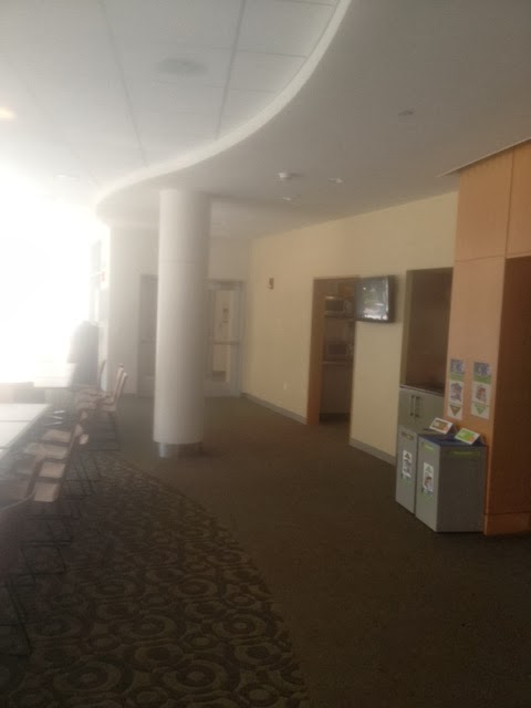
This is the cafeteria at my work (design by Ellenzweig Architects and RJS Associates). I love the way that a change in carpet mirrors the curved gypsum ceiling, sort of creating a two dimensional statement of where the path and the seating area differentiate. Too, this makes use of the structural beam as sort of a mass which anchors your idea of place. To the right of the beam is the path and to the left is the seating. Of course, there are other thresholds which could be seen in this picture as well.

This is the threshold between my kitchen and my bedroom. I live with two friends in a two bedroom, but my landlady did not want me to install a door, so instead I hung a fabric to further delineate the space between my private space, and my semi-public kitchen. Because this deviates from the standard door as a boundary, many of my friends who visit with my roommates feel comfortable walking in without knocking or asking, even though they know that this is my bedroom.

The threshold between the parking lot and the Dunkin Donuts in Wellington Circle is clearly distinguished. Despite using many tools, such as material change, obstacles, and parking spot lines, there is a distinct straight line which each follow.

The New England Law Society appropriates some of the public sidewalk space to become a threshold for the extents of the building. Pedestrians walking by purposely walked around the overhang. Partly, I believe, due to the obstacles, but also partly I think due to an unconscious decision not to enter the NELS space. I took some photographs with people, but I felt uncomfortable posting them on the internet. I will go on photoshop and blur out the faces; I think that it is interesting how far out of the way that the pedestrians walked.

Finally, perhaps the most beautiful threshold that I came across in the past few days was at the Emerald Lounge at the Revere Hotel. The entire interior, based on Oz, uses intense lighting as part of its design, however, most spaces of rest, such as this couch, have warm orange incandescent lights above. The harsh blue creates a distinct boundary by making it uncomfortable to stand in that area. Too, the back of the couch helps emphasize the distinction of where occupation is welcome, and where it should be avoided.
Many of these photographs were taken while I was exploring the area after a Boston Design Museum event at the W. One part of the event involved designing models of public benches, and being particularly cognizant of thresholds, I tried to see how I could expand the space of my bench, using texture changes and color changes.
.JPG)
Was I successful?
Please pay no mind to the plaster on my bedroom "door."
ReplyDelete